Seaborn is a Python data visualization library built on top of matplotlib, designed to simplify the creation of attractive and informative statistical graphics. It integrates seamlessly with pandas DataFrames, making it ideal for exploratory data analysis. With just a few lines of code, users can generate complex plots such as histograms, box plots, violin plots, and regression plots, all with built-in themes and color palettes that enhance readability and presentation.
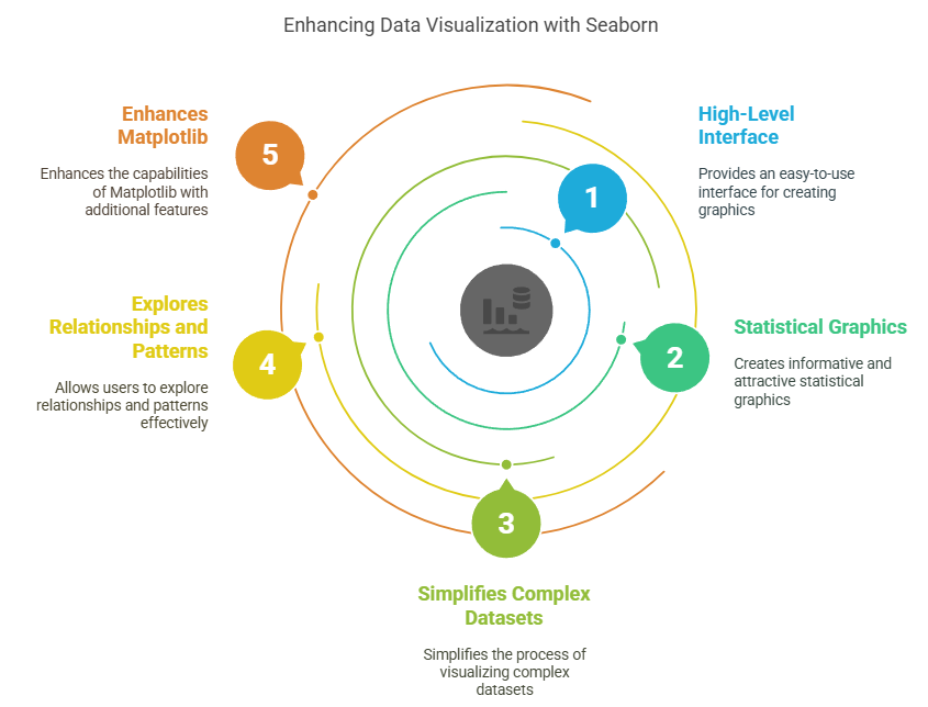
One of Seaborn’s standout features is its ability to automatically perform statistical aggregation and visualization, such as plotting means with confidence intervals. It also supports multi-plot grids through functions like FacetGrid and pairplot, which are useful for comparing data across categories. Additionally, Seaborn offers specialized plots like heatmaps for correlation matrices and line plots for time series data, making it a versatile tool for both simple and advanced data analysis tasks.
import seaborn as sns
import matplotlib.pyplot as plt
import pandas as pd

# Load a sample dataset
tips = sns.load_dataset("tips")

# Create a simple scatter plot
sns.scatterplot(data=tips, x="total_bill", y="tip")
plt.title("Relationship between Total Bill and Tip")
plt.show()
Setting up Seaborn
# Install Seaborn (run this in your terminal or command prompt)
# pip install seaborn

import seaborn as sns
import pandas as pd
import matplotlib.pyplot as plt

# Set the default Seaborn style
sns.set_theme()

# Load a built-in dataset
df = sns.load_dataset("penguins")
print(df.head())
Customizing Plot Aesthetics
# Set a specific style
sns.set_style("whitegrid")

# Create a plot with a custom color palette
sns.scatterplot(data=df, x="bill_length_mm", y="bill_depth_mm", hue="species", palette="deep")
plt.title("Penguin Bill Dimensions by Species")
plt.show()

# Reset to default style
sns.set_style("darkgrid")
Distribution Plots
# Create a distribution plot
sns.displot(df, x="flipper_length_mm", kde=True, hue="species")
plt.title("Distribution of Flipper Lengths")
plt.show()
Categorical Plots
# Create a box plot
sns.boxplot(data=df, x="species", y="body_mass_g")
plt.title("Body Mass Distribution by Penguin Species")
plt.show()

# Create a violin plot
sns.violinplot(data=df, x="species", y="body_mass_g")
plt.title("Body Mass Distribution (Violin Plot)")
plt.show()
Regression Plots
# Create a regression plot
sns.regplot(data=df, x="flipper_length_mm", y="body_mass_g")
plt.title("Relationship between Flipper Length and Body Mass")
plt.show()
Pair Plots
# Create a pair plot
sns.pairplot(df, hue="species")
plt.suptitle("Pair Plot of Penguin Measurements", y=1.02)
plt.show()
Heatmaps
Heatmaps are useful for visualizing the correlation between variables in a dataset.
# Create a correlation matrix
corr_matrix = df.corr()

# Create a heatmap
sns.heatmap(corr_matrix, annot=True, cmap="coolwarm")
plt.title("Correlation Heatmap of Penguin Measurements")
plt.show()
Facet Grids
Facet grids allow you to create multiple plots for different subsets of your data.
# Create a facet grid
g = sns.FacetGrid(df, col="species", height=4, aspect=1.2)
g.map(sns.scatterplot, "bill_length_mm", "bill_depth_mm")
g.add_legend()
plt.suptitle("Bill Dimensions by Species", y=1.05)
plt.show()
Example: Environmental Data Analysis
# Create sample air quality data
air_quality = pd.DataFrame({
    'city': ['New York', 'London', 'Tokyo', 'Beijing', 'Mumbai'] * 12,
    'month': list(range(1, 13)) * 5,
    'aqi': [50, 45, 40, 80, 70, 55, 48, 42, 85, 75, 60, 52,
            40, 35, 30, 75, 65, 45, 38, 32, 78, 68, 50, 42,
            35, 30, 25, 70, 60, 40, 33, 27, 73, 63, 45, 37,
            85, 80, 75, 120, 110, 90, 83, 77, 125, 115, 95, 87,
            75, 70, 65, 110, 100, 80, 73, 67, 115, 105, 85, 77]
})

# Create a line plot to show AQI trends
sns.lineplot(data=air_quality, x='month', y='aqi', hue='city')
plt.title('Air Quality Index (AQI) Trends Across Cities')
plt.xlabel('Month')
plt.ylabel('AQI')
plt.show()
Example: Scientific Data Visualization
import numpy as np

# Generate sample exoplanet data
np.random.seed(42)
n_planets = 100
planet_data = pd.DataFrame({
    'mass': np.random.uniform(0.1, 10, n_planets),  # Earth masses
    'orbital_period': np.random.uniform(1, 1000, n_planets),  # Earth days
    'star_type': np.random.choice(['G', 'K', 'M'], n_planets)
})

# Create a scatter plot with logarithmic scales
sns.scatterplot(data=planet_data, x='mass', y='orbital_period', hue='star_type', alpha=0.7)
plt.xscale('log')
plt.yscale('log')
plt.title('Exoplanet Mass vs. Orbital Period')
plt.xlabel('Planet Mass (Earth masses)')
plt.ylabel('Orbital Period (Earth days)')
plt.show()
Advanced Customization
g = sns.JointGrid(data=df, x="bill_length_mm", y="bill_depth_mm", hue="species")
g.plot_joint(sns.scatterplot)
g.plot_marginals(sns.kdeplot)
g.add_legend()
plt.suptitle("Bill Length vs. Depth with Marginal Distributions", y=1.02)
plt.tight_layout()
plt.show()
Seaborn with Time Series Data
# Generate sample time series data
dates = pd.date_range(start='2023-01-01', end='2023-12-31', freq='D')
ts_data = pd.DataFrame({
    'date': dates,
    'value': np.cumsum(np.random.randn(len(dates))) + 100
})

# Create a time series plot
sns.lineplot(data=ts_data, x='date', y='value')
plt.title('Time Series Plot')
plt.xlabel('Date')
plt.ylabel('Value')
plt.xticks(rotation=45)
plt.tight_layout()
plt.show()
Combining Seaborn with Matplotlib
# Create a Seaborn plot
fig, ax = plt.subplots(figsize=(10, 6))
sns.scatterplot(data=df, x="flipper_length_mm", y="body_mass_g", hue="species", ax=ax)

# Add Matplotlib customizations
ax.set_title("Penguin Flipper Length vs. Body Mass", fontsize=16)
ax.set_xlabel("Flipper Length (mm)", fontsize=12)
ax.set_ylabel("Body Mass (g)", fontsize=12)
ax.legend(title="Species", title_fontsize=12)
ax.grid(True, linestyle='--', alpha=0.7)

plt.tight_layout()
plt.show()